This dashboard called "The Life of Helsinki" has been designed to provide an overview to the city officials about the main trends of the city in terms of people flow and usage. These specific views are taken from the data coming from the Mobile App "Helsinki in a Snap". The dashboad has been produced by Snap4City team, you can find more and more information on Https//www.snap4city.org
Dashboard link: https://main.snap4city.org/view/index.php?iddasboard=MTc1Mg==
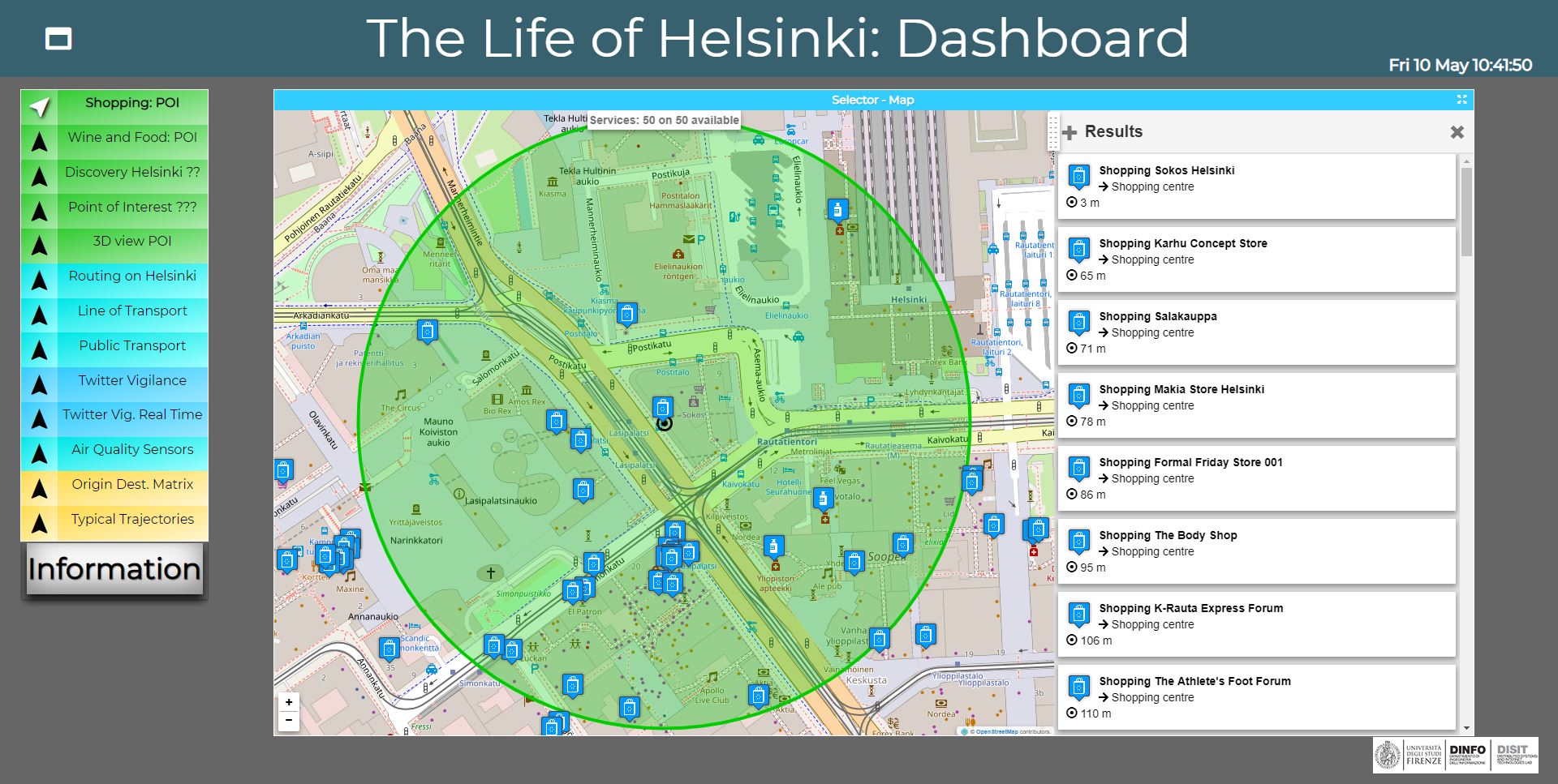
On the left you can select to see on map (maps or other kind of representations):
-
Entertainment Events: list and location of events of entertainment in Helsinki area (a part of them).
-
Wine and Food POI: PINs about the location of wine and food locations around your position. On the left of the map are reported a list of points of interest and the distance of each point from your position.
-
Shopping: POI: PINs about the shopping locations around your position. On the left of the map are reported a list of points of interest and the distance of each point from your position.
-
Discovery Helsinki: allows to select all the POIs around you, the suggested POIs around you or the last recommendations using the PIN using the pop up on the map.
-
Point of Interest: all point of interests in the Helsinki area (see below).
-
3D view POI: 3D Helsinki map with the possibility to visualize select values of sensors or of POI by using the widget on the top left (see below).
-
Routing on Helsinki: MicroApplication to perform routing in the Helsinki area (see below).
-
Line of Transport: MicroApplication showing the public transport stops, time tables and paths (if any). The upper button is to search stops around your position (see below).
-
Public Transport: PINs about the location of bus/tram stops around your position. On the left of the map are reported the details about each bus stop.
- Twitter Vigilance: The trends of Tweets for the search related to the channel Antwerp, which is monitoring a large number of users posts, hashtags, and keywords. It’s possible to select the period (from – to). This data comes from Twitter Vigilance Service of DISIT Lab Https://www.disit.org/tv a detailed of produced trends may allow to understand the moods of the city. The data are updated daily and for the last day, hourly.
- Twitter Vig. Real Time: The trends of Tweets for the search related to the channel Antwerp, which is monitoring a large number of users posts, hashtags, and keywords.. This data comes from Twitter Vigilance Service of DISIT Lab: Https://www.disit.org/rttv. a detailed of produced trends may allow to understand the moods of the city. The data are updated very 5 minutes. It is possible from that page to perform the NLP (Natural Language Processing) analysis, and also perform the Sentiment Analysis of the collected tweets. This approach permits to monitor the moods of the events in the city in real time.
-
Air Quality: A view of Air Quality it includes data and heatmaps of seveal kind:
- Noise: value and real time heatmap of noise levels in the Helsinki area. The heatmap is upded every 2 hours. On the Heatmap Controls widget: the animated values of the entire 24 hours are available, as well as with "Prev" button the past heatmaps.
- PM10: value and real time heatmap of pollutant levels in air in terms of PM10 (measured in µg/m3) particles in the Helsinki area. The heatmap is updedd every 2 hours. On the Heatmap Controls widget: the animated values of the entire 24 hours are available, as well as with "Prev" button the past heatmaps.
- PM2.5: value and real time heatmap of pollutant levels in air in terms of PM2.5 (measured in µg/m3) particles in the Helsinki area. The heatmap is upded every 2 hours. On the Heatmap Controls widget: the animated values of the entire 24 hours are available, as well as with "Prev" button the past heatmaps.
- NO2: value and real time heatmap of pollutant levels in air in terms of nitrogen dioxide (NO2 measured in µg/m3) in the Helsinki area. The heatmap is upded every 2 hours. On the Heatmap Controls widget: the animated values of the entire 24 hours are available, as well as with "Prev" button the past heatmaps.
- Air Quality Index heatmap: real time heatmap of air quality index of the Helsinki area, provided by the FMI. The resulting index from 1 to 10 indicates the quality of air. The heatmap is upded every 2 hours. On the Heatmap Controls widget: the animated values of the entire 24 hours are available, as well as with "Prev" button the past heatmaps.
- EAQI: value and real time heatmap of European Air Quality Index. The resulting index from 1 to 5 indicate the quality of air. On the Heatmap Controls widget: the animated values of the entire 24 hours are available, as well as with "Prev" button the past heatmaps.
- Enfuser pred. AQI: value and heatmap of Air Quality Index hourly Enfuser predictions. The animatedpredictions of the entire 24 hours are available, clicking on the "Next" button on the Heatmap Controls widget you can see the forecast.
- Enfuser pred. PM10: value and heatmap of PM10 particles hourly Enfuser predictions in µg/m3. The animated predictions related to the entire 24 hours are available, clicking on the "Next" button on the Heatmap Controls widget you can see the forecast.
- Gral pred. PM10: value and heatmap of PM10 particles hourly predictions in µg/m3 measured 3 meters on the ground and computed using Gral model. The predictions related to the entire 24 hours are available, clicking on the "Next" button on the Heatmap Controls widget you can see the forecast.
- (i) information about Air Quality parameters
-
Origin Dest. Matrix: clicking on points in the map is possible to see the most probably incoming or outcoming flows from that point to the mostly uised destination points in the time slot. This means that the tool allows to perform an analysis of the people movements in the area (see below). The tool may be used to perform Inflow and Outflow analysis on the basis of the data collected from the "Antwerp in Snap" mobile application. By the tool, it is possible to select the time slots, the modality of showing the data, etc. The tool allows you to select the zoom at which you can do the analysis.
-
Typical Trajectories: visualization of typical trajectories per hour in the Helsinki area (see below). The trajectories are clustered together to extract for comulation the most relevant and freequently used paths. The tool allows you to select the zoom at which you can do the analysis.
Forum Discussion:
- a Forum for collecting comments, requests to improve and discussion open among the users of the dashboard.
On the Map, several information may appear:
-
PINs about POI where you can select a PIN to see information on a new information window on the left of the map
-
Name
-
Details
-
Description
-
"Around Here" botton to discover all POI around the PIN selected
-
Above the "Around Here" botton, three icons can be selected:
-
The first icon where you can upload images
-
The second icon where you can add the POI on your favorites
-
The third icon to open the navigator with the path from your position to the POI
-
-
-
PINs about sensors where you can select a PIN to see information on a new information window on the left of the map
-
Details
-
Description
-
Real Time data: clicking on the PIN is possible to monitor all the real time and predicted/enfuser measures related to that sensor
-
"Around Here" botton to discover all sensors around the PIN selected
-
Above the "Around Here" botton, three icons can be selected:
-
The first icon where you can upload images
-
The second icon where you can add the sensor on your favorites
-
The third icon to open the navigator with the path from your position to the sensor
-
-
-
Origin Destination Matrix Information widget on the left of the map
-
The tool allows to define the resolution at which you can see the data,
- Grid (on/off)
-
Flows: inflow and outflow
- Hour: to select a specific hour
-
OD Matrix: open the matrix in a new tab. The flow can be ordered by cluster, frequency or name
-
Radius (km)
-
-
Typical Trajectories widget positioned at the top right of the map
-
The tool allows to define the resolution at which you can see the data,
-
Radius: the slider that can be used to correct the radius of the point in the map
-
Max Opacity: the slider that can be used to correct the opacity of the point in the map
-
Hour: to select a specific hour
-
-
3D view POI menu positioned at the top left of the map that allows to:
-
select the Municipality or a specific address
-
select a Services Category between Regular Services, Tranversal Services or 3D Data
-
select the number of results that can be viewed
-
select the Serarch Range
-
It is also possible to program the automated visualization of real time data value as solid growing from the city.
-
-
The Routing on Helsinki selector appears on the top of the map where you can select:
-
the type of transportations mean among bus, car, and on foot (choosing between shortest path or quiet path)
-
departure date and time
-
the starting point (that is your position of default)
-
the ending point
-
-
Line of Transport selector where you can:
-
search stops around you
-
search stops by address/name and city
-
search stops by agency
-
-
Points of Interest menu positioned at the top left of the map that allows to:
-
select the position of a selected bus clicking with the Public Transport tab
-
compute a POIs search by text using the Text Search tab
-
select the municipality with the Municipality tab
-
compute a POIs using the address with the Address Search tab
-
select an event using the Event tab and selecting a specific time interval (day, week, month)
-
The data of this dashboard have been collected by Snap4City according to the PCP lanched by Select4Cities project.
The data sources used for creating this dashboard are listed in the following web pages:
Helsinki: https://www.snap4city.org/drupal/node/364
Antwerp: https://www.snap4city.org/drupal/node/363
 European Commission Affiliation Select4Cities project has received funding from the European Union’s Horizon 2020 research and innovation programme under grant agreement No 688196. Please note that this website represents the view of Snap4City, with the support of Select4Cities project and that the Commission is not responsible for any use that may be made of the information it contains.