The WidgetDeviceTable is a widget shown on the dashboard that has the functionality of displaying the data extracted from a query in a service map in table format.
This widget can be created in an IOTApp application via a specific filter node called deviceTable. This node is able to create the widget and send it the query and data necessary to create the table.
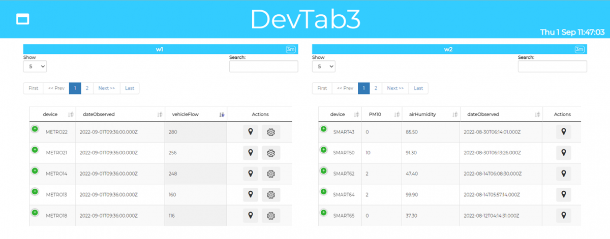 Example of dashboard
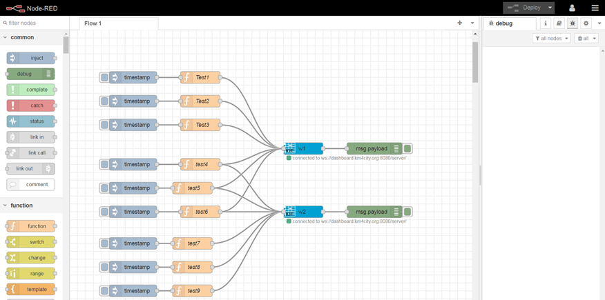 Example of IOTApp side
This widget can also be created using the dashboard wizard, it can be found in the “Multi data widgets” section in the Dashboard Wizard tool, so without passing from IoTApp/Process Logic.
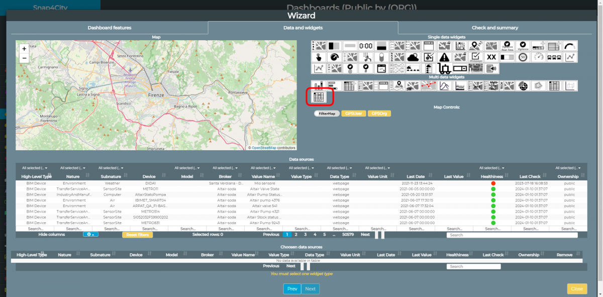
Example of widgetTable wizard side
Dashboard Widget
The widget layout consists of a table consisting of a variable number of columns.
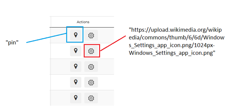
The only columns that are always shown are device, which shows the name of the device and action which shows one or more clickable buttons.
Some columns are visible by default in the table, while others are hidden and are only shown if you click the + button in the left corner of each row.
The Device and Actions columns and the possibility to show which one depend on the query received from iotApp.
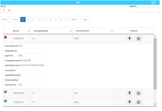
The widget also features a paging system to scroll through the lines, a menu for selecting the number of visible lines for each page and a search filter.
IotApp
DeviceTable widgets are created via an IOTApp.
The node filter used in the creation of the widget is WidgetTable, it is a dashboardDevice node present in the module node-red-contrib-snap4city-user from version 0.9.26 and more recent.
 This filter is used in two stages. At the time of creation it is necessary to authenticate, select the name of the dashboard and the name of the widget to create.
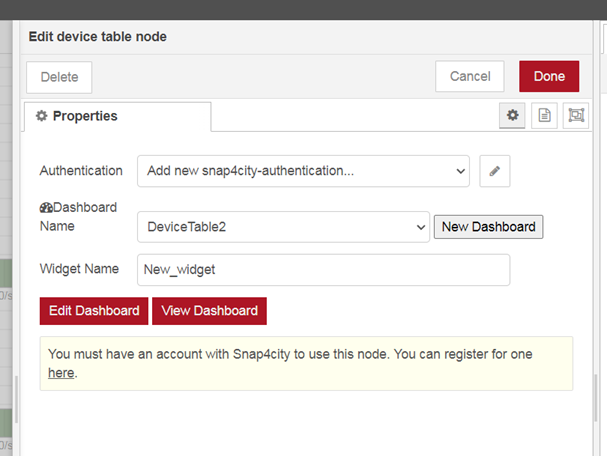
This operation will create an empty widgetDeviceTable in the dashboard. The dashboard can be accessed directly via the "View Dashboard" and "Edit Dashboard."
Input
The widget needs an input to show the data.
This query is contained in a json transmitted by the IOTApp to the widget in the dashboard by a "function" node filter.
The json can also be set from the dashboard editor, by changing the content of “Configuration properties” in “Specific widget properties” section (From the “more options” modal of the widget)
The content of the widget can be changed at any time by inserting another json and running it. The table updates automatically.
The json contains the following elements:
Example1:
{
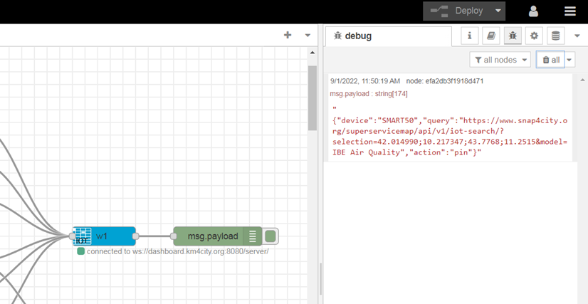
"ordering":"dateObserved", "query":"https://www.snap4city.org/superservicemap/api/v1/iot-search/?selection=42.014990;10.217347;43.7768;11.2515&model=metrotr...",
"actions":[ "pin" ],
"columnsToShow":[
"dateObserved",
"vehicleFlow"
]
}
Example2:
{
"ordering":"vehicleFlow", "query":"https://www.snap4city.org/superservicemap/api/v1/iot-search/?selection=43.77;11.2&maxDists=200.2&model=metrotrafficsenso...",
"actions":[ "https://upload.wikimedia.org/wikipedia/commons/thumb/6/6d/Windows_Settings_app_icon.png/1024px-Windows_Settings_app_icon...",
"pin"
],
"columnsToShow":[
"dateObserved",
"vehicleFlow"
]
}
Query
Query the actual API to obtain the list of devices and the corresponding metadata.
The query consists of a filter followed by filters.
- Prefix: https://www.snap4city.org/superservicemap/api/v1/iot-search/
- Filters:
- selection: This mandatory filter is used to define the area within which to extract the devices. It can be composed of four coordinates separated by a semicolon that form a Bounding Box (Example1), or forming a circle with a single coordinate in the center and a radius defined by the maxDists filter (Example2).
- model: IotModel of the devices.
- valueFilters: Results can be filtered by the values of some metadata. For example, you can only receive devices with vehicleFlow> 10. More than one filter can be inserted, divided by semicolons.
- serviceUri: Through this filter it is possible to restrict the number of query results to a set of devices for which a list of serviceUri is provided. (Example2)
ordering
The field used to set the default sort order of the table by a column. The user can change the order of the table in the dashboard by clicking on a column header.
actions
Array of icons for the "Action" buttons, they can be "pin" or correspond to the url of an image.
For example, in "Example 1", action consists only of an element of value "pin" which corresponds to the pointer icon on the map and is a default image. "In example 2" there are two elements, in addition to "pin" there is a url corresponding to the png image in a cog.
columnsToShow
Array of columns tables displayed by default. It represents a subset of the table columns. The others are hidden and viewable by clicking on the expand icon (represented by a "+" sign) in each line
columnTitles
Array of json object that specify how columns are represented. For each column it is possible to define the name that should be displayed on the header of the table and for datetime columns we can define the format (see Moment.js documentation).
Example: "columnTitles":[
{"value":"device","name":"OtherNameForDevice”},
{"value":"dateObserved","name":"Data","format":"DD/MM/YYYY HH:mm"}
]
Messages (Only IoT app)
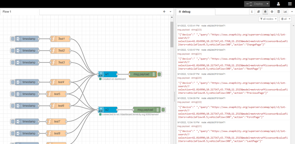
The widget is able to send messages to the IotApp that generated it, which can be viewed in the Debug section of NodeRed.
These messages are triggered whenever one of the following operations is performed:
- A button in the "action" column is clicked.
- The pagination of the table is scrolled.
- Click on the + button to show or hide the columns of each row.
- Change the number of visible lines for each page.
- Change the sort order of the table by clicking on a column header.
The message sent to the iotApp consists of a json with these keys:
- Device: device name of the row (in some actions such as the change of pages is empty)
- Query: query of the table
- Action: type of action.
{
“device”:”METRO18”,
“action”:”ChangePage”
}

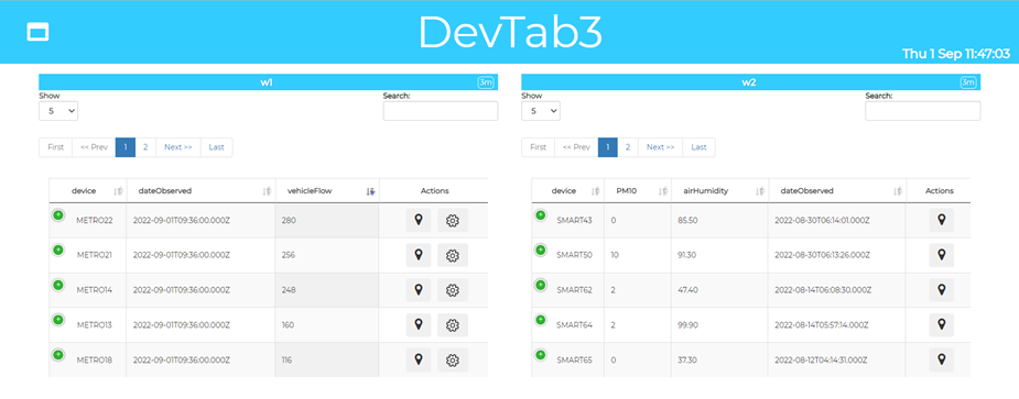
 Example of messages