 Within the Snap4City platform, several types of dashboards are available for monitoring data related to the SADI-MIAC project. These dashboards are listed below. A detailed description of the features of each dashboard is provided in the following sections, each dedicated to one dashboard type.
Store Dashboard
For each store that joins the consortium, a dedicated dashboard has been developed with the design shown in the following figure, where three main parts can be identified (A, B, C).
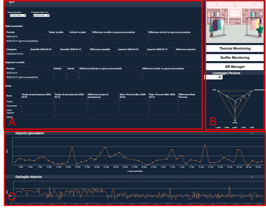
Fig.1
In particular, part A consists of an automatic tool that allows you to select two different dates from the calendar in the upper left, in order to compare the data for the selected days (the dates do not have to be consecutive).
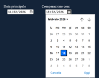
Fig.2
After selecting the dates for "Main date" and "Compare with:", the tool automatically displays the differences between the first and second date in the table below, highlighting the differences for "Economic data", "Entries and Exits", and "Zones".
The "Economic data" table shows the comparison results, for the selected days, in terms of sales, with reference to the total revenue and the corresponding number of items sold.
The "Entries and Exits" table shows the comparison results, for the selected days, in terms of number of customers, with the corresponding number of entries and exits.
The "Zones" table shows the comparison results, for the selected days, in terms of customer dwell time in the various store areas, including, for example, specific zones such as the checkout area or the whole store.
In addition, the charts in part C (described below) update automatically to show the data for the week that includes the selected "Main date".
Part B consists of a set of buttons that provide direct access to other dashboards and features. From top to bottom, the first button shows the image of the selected store and links to the official website of that store, if available. The following buttons open the dashboards for thermal camera monitoring, sniffer monitoring, and the QR manager, respectively; their features are described in the following sections. Part B also includes a chart (called "spider") that summarizes the number of people in corresponding areas within the store.
Part C consists of a list of charts, one below the other. These charts show the trend over time of the metrics considered. The metrics are as follows:
- Daily amount: shows the trend of the store's daily (total) revenue over the last 6 months.
- Amount details: shows the trend of the various amounts collected by the store at different times of the day. This trend is displayed for the last 6 months.
- Revenue forecast: allows you to view the forecast trend of revenue, automatically processed using AI algorithms, and compare it graphically with the actual revenue data (which has a shorter time series than the forecast), highlighting patterns, deviations, and possible future developments in revenue. Revenue forecasts are generated using Machine Learning models trained on historical sales data, entries, the operating calendar, time trends, external traffic, and weather conditions, in order to estimate future trends in collected amounts.
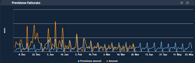
Fig.3
- Number of products sold daily: shows the trend of the daily (total) number of items sold by the store over the last 6 months.
- Daily entries/exits: shows the trend of the daily (total) number of entries and exits in the store over the last 6 months. In this chart, the entry and exit trends can be highlighted separately by selecting and deselecting the corresponding legend items at the bottom of the chart.

Fig.4
- Entry/exit details: shows the trend of the various entries/exits from the store at different times of the day. This trend is displayed for the last 6 months. In this chart, the entry and exit trends can be highlighted separately by selecting and deselecting the corresponding legend items at the bottom of the chart (see Daily Entries/Exits).
- Entries forecast - daily: allows you to view the forecast trend of the number of entries for the current day, automatically processed using AI algorithms. Entry forecasts are calculated using Time Series Analysis models based on historical access data, weekly patterns, operating time slots, the calendar, and external factors, with the aim of estimating the relative time distribution during the day.
- Entries forecast - historical: allows you to view and compare the AI-based forecast results described above with historical actual data, in order to assess their accuracy.

Fig.5
- Conversion rate - no. sales/no. entries: shows the trend of the percentage of entries that generate a sale. This trend is displayed for the last 6 months.
- Average number of people in store zones: shows the trend of the average number of customers in different areas of the store at certain times of the day (typically every 6 hours). This trend is displayed for the last 6 months. The resulting chart is the cumulative trend, obtained by summing the data corresponding to the different areas of interest. The visualization can be changed by selecting or deselecting one or more items in the legend at the bottom of the chart, so that the contribution of the selected areas can be included in or excluded from the overall trend.

Fig.6
- Average dwell time in store zones: shows the trend of the average customer dwell time in different areas of the store at certain times of the day (typically every 6 hours). This trend is displayed for the last 6 months. In this chart, the trends for the different store areas can be highlighted separately by selecting and deselecting the corresponding legend items at the bottom of the chart (see Daily Entries/Exits).
- Thermal camera count: shows the trend of the count provided by the thermal camera at certain times of the day (typically every 6 hours). This trend is displayed for the last 6 months. The resulting chart is the cumulative trend, obtained by summing the data corresponding to different types of users (people, bicycles, and strollers). The visualization can be changed by selecting or deselecting one or more items in the legend at the bottom of the chart, so that the contribution of the selected areas can be included in or excluded from the overall trend (see Average number of people).
- Wi-Fi/Bluetooth sniffer count: shows the trend of devices detected by the sensor via Wi-Fi/Bluetooth at certain times of the day. This trend is displayed for the last 6 months.
All the charts described above allow you to select a portion of the displayed area in order to zoom in on the period of interest. Once a zoom is applied to a single chart, all the others update automatically to show the same time interval. The "Reset zoom" command restores the original view, canceling the applied zoom. The arrows in the upper right allow you to scroll through adjacent time periods.
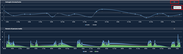
Fig.7
Thermal Camera Monitoring Dashboard
In this context, two dashboards are available for monitoring data detected by thermal cameras: one for the Florence area of Via Gioberti and the other for the San Giovanni Valdarno area. Based on its location, each store automatically accesses the monitoring dashboard for its area using the "Thermal monitoring" button inside the Store Dashboard (see the previous section).
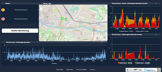
Fig.8
The dashboard shown above consists of a selector on the left that enables or disables the display of data on the map. The popup associated with the sensor icon on the map controls the visualization of the time trend shown below the map (see the following image). Below the selector there is a button for accessing sniffer monitoring.
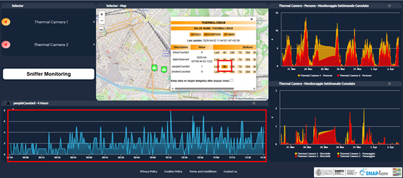
Fig.9
On the right, charts are included to visualize the weekly cumulative trend, obtained by summing the data corresponding to the monitoring of people (top) and bicycles and strollers (bottom) detected by all sensors in the store's area. The visualization can be changed by selecting or deselecting one or more items in the legend at the bottom of the chart, so that the contribution of the selected items can be included in or excluded from the overall trend.
As in the previous section, all the charts described above allow you to select a portion of the displayed area in order to zoom in on the period of interest. The "Reset zoom" command restores the original view, canceling the applied zoom. The arrows in the upper right allow you to scroll through adjacent time periods.
Sniffer Monitoring Dashboard
In this context, two dashboards are available for monitoring data detected by sniffers: one for the Florence area of Via Gioberti and the other for the San Giovanni Valdarno area. Based on its location, each store automatically accesses the monitoring dashboard for its area using the "Sniffer monitoring" button inside the Store Dashboard (see the dedicated section).
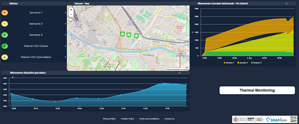
Fig.10
The dashboard shown above consists of a selector on the left that enables or disables the display of data on the map. The popup associated with the sensor icon on the map controls the visualization of the time trend shown below the map (see the previous section for similar operation). On the right, charts are included to visualize the weekly cumulative trend, obtained by summing the data corresponding to sensor monitoring in the store's area. The visualization can be changed by selecting or deselecting one or more items in the legend at the bottom of the chart, so that the contribution of the selected items can be included in or excluded from the overall trend. As in the previous section, all the charts described above allow you to select a portion of the displayed area in order to zoom in on the period of interest. The "Reset zoom" command restores the original view, canceling the applied zoom. The arrows in the upper right allow you to scroll through adjacent time periods. At the bottom right there is a button for accessing thermal camera monitoring.
The selector on the left also allows you to activate advanced functions called "Hourly OD Matrices" and "Daily OD Matrices". These functions open a panel in the upper-right corner of the map, where several settings and controls are available, including selection of the time interval, the choice of whether to analyze inflow or outflow data, modification of the OD matrix opacity, and navigation among different dates by moving forward or backward in time. In the OD matrix visualization, the blue highlighted area represents the selected area of interest, while the colored areas indicate incoming or outgoing flows to and from that zone, expressed as percentages.
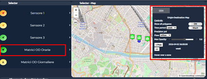
Fig.11
Dashboard QR Manager
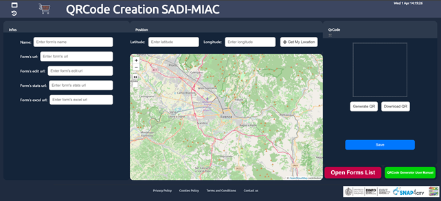
Fig.12
Summary
This guide provides a quick procedure for creating a QR Code in SADI-MIAC to collect user feedback through Google Forms.
The main steps are:
- Create a Google Form
- Collect data through URLs
- Create the QR Code
- View and manage forms through the Form List dashboard
Prerequisites
Before starting, make sure you have:
- A Google account
- A Snap4City account
Creating a Google Form
Sign in to Google Forms using your Google credentials.
From the main page, select the "Blank form" option to create a new form.
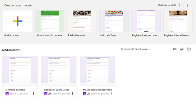
Fig.13
Once the form has been created, you can customize its title and question structure.
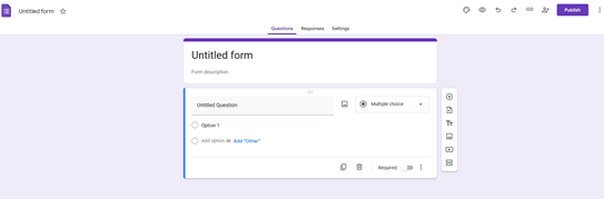
Fig.14
Title
Here you can edit the title (1) and the description (2).
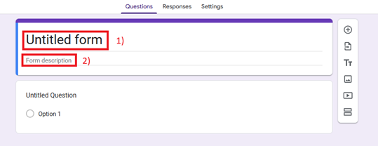
Fig.15
The project title of the form is automatically updated based on the form title.
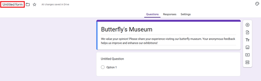
Fig.16
Setting up different languages
The first question in the form must allow the user to select a language.
Select "Untitled Question" (1) and enter a question such as "Select your language". Set the answer type to "Multiple choice" (2). Add another language using "Option 1" (3). Additional languages can be added using "Add option" (4). Repeat the process until all desired languages are present.
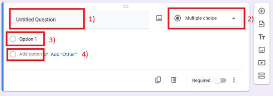
Fig.17
Enable the "Required" option to ensure that the user selects a language before continuing.
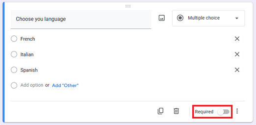
Fig.18
Feedback questions
To organize questions by language, you can use sections.
Follow this procedure. In the sidebar, select "Add section".
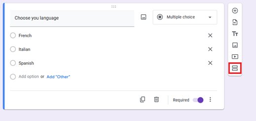
Fig.19
Assign a title to the new section.
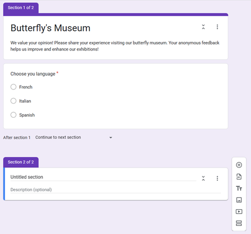
Fig.20
Go back to the previous section. Click the three dots in the lower right. Select "Go to section based on answer".
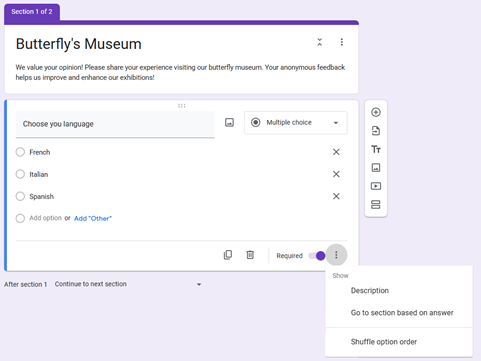
Fig.21
By adding "Continue to next section" to each answer, the interface changes.
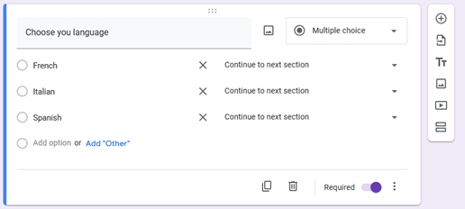
Fig.22
Clicking on it allows you to select the corresponding section.
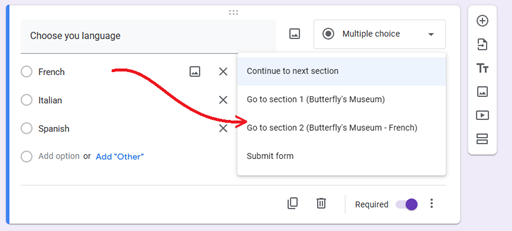
Fig.23
You can now add a new question by clicking the "Add question" button from the menu on the right.
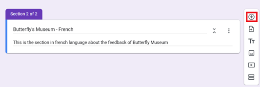
Fig.24
Follow the previous procedure for creating new questions in order to define the questionnaire.
The last section of the form automatically submits the responses. For intermediate sections, you must manually set the "Submit form" option in the "After section..." menu to prevent the user from being redirected to other language sections.
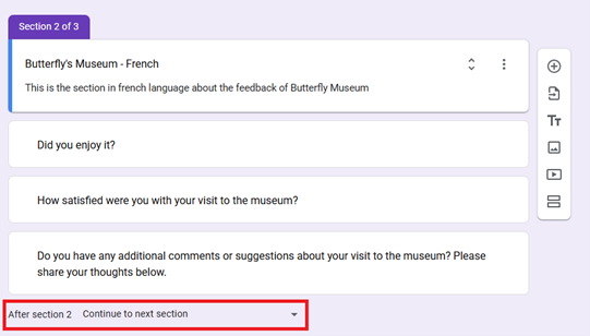
Fig.25
Different types of questions can be used to collect feedback:
- Yes/No questions
- Open-ended questions
- Likert scale questions
a.Yes/No questions
This is the simplest type of question. Typical options are "Yes" and "No". The "Maybe" option can also be added.
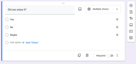
Fig.26
b.Open-ended questions
To create an open-ended question, select the "Paragraph" option. The user will be able to freely enter their feedback.
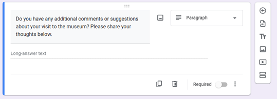
Fig.27
c.Likert Scale Question
The Likert scale allows users to express their level of agreement with a specific statement. A scale from 1 to 5 is generally used. The scale typically ranges from Strongly Disagree to Strongly Agree. To create this type of question, enter the statement and configure five answer options with "Multiple choice" enabled.
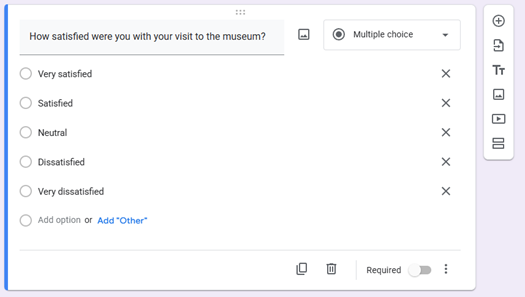
Fig.28
Settings
In the "Settings" tab, make sure that the email address collection option is disabled.
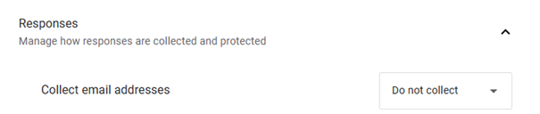
Fig.29
Publishing
Now that the form has been completed, you can proceed with publication. Open the "Responses" tab and select "Link to Sheets" (1). Create a spreadsheet to collect the data (2) and assign it the corresponding title (3). Then confirm with "Create" (4).
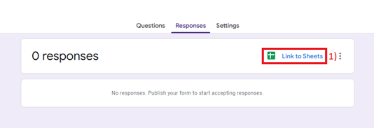
Fig.30
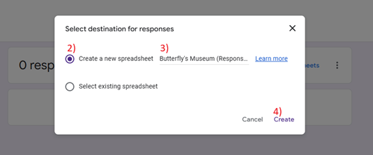
Fig.31
Then select "Publish" to publish the form.
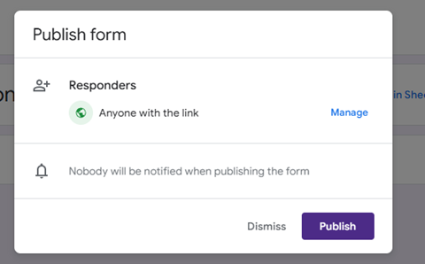
Fig.32
Data Collection through URLs
The following is a list of URLs needed for the next step.
Form URL
The form URL can be retrieved by clicking the "Copy responder link" button and copying the link.
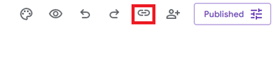
Fig.33
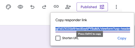
Fig.34
Form Edit URL
This URL refers to the URL of the web page in the "Questions" tab.

Fig.35
Form Responses URL
This URL refers to the URL of the web page in the "Responses" tab.

Fig.36
Form Sheet URL
This is the URL for the spreadsheet created here (Publishing). To obtain it, open the "Responses" tab and click "View in Sheets".
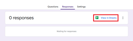
Fig.37
This opens a new document; copy the corresponding URL.
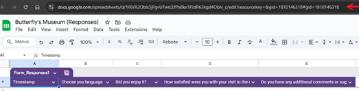
Fig.38
QR Code Creation
Sign in to Snap4City with your credentials and open the "QRCode Creation SADI-MIAC" dashboard.
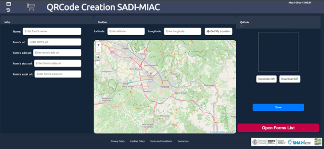
Fig.39
The dashboard interface consists of three main parts. The left side is used to enter the form URLs. The central part contains a map for selecting the QR Code location. The right side is used to create and download the QR Code image.
Step-by-Step Guide
- Enter the QR Code name, without spaces or special characters (such as $, %, &, (, ), ...).
- Enter the Form URL
- Enter the Form Edit URL
- Enter the Form Responses URL
- Enter the Form Sheet URL
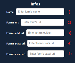
Fig.40
- Select the position on the map or enter the service location coordinates.
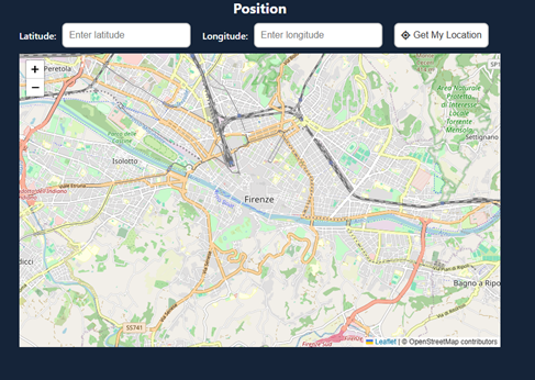
Fig.41
- Generate the QR Code for this form and download it if necessary.
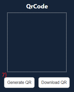
Fig.42
- Save the configuration. This may take some time.
- Open the Form List Dashboard to view and manage the forms that have been created.
Viewing and Managing Forms through Form List
In the "Form List SADI_MIAC" dashboard, you can view and manage all created forms.
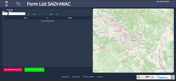
Fig.43
The screen shows the list of forms on the left and the map with the QR Code locations on the right.
Each form has several buttons for management:
- Pin: shows the QR Code on the map
- Link: opens the form
- Editor: opens the form edit page
- Stats: displays the collected responses
- Excel: opens the data spreadsheet
- QRCode: displays the QR Code image

Fig.44
The red "Open QRCode Generator" button opens the previous dashboard for creating QR Codes.
Examples
The following are some public form examples.
