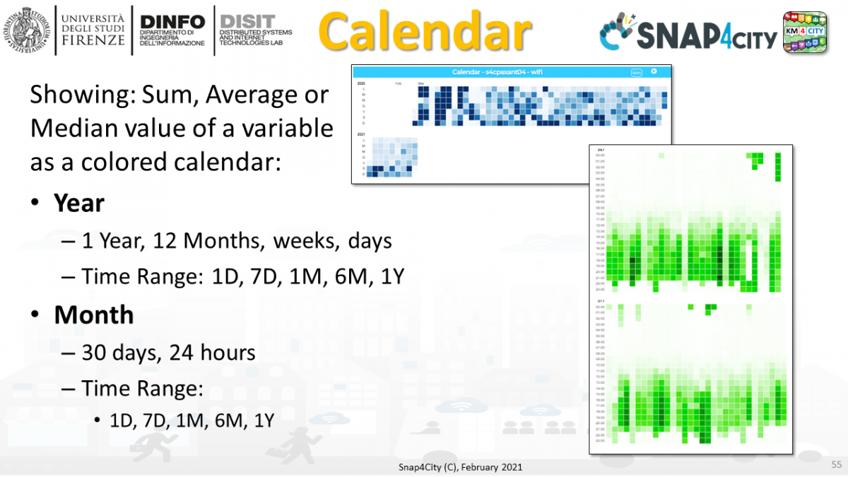
Calendar widget can showing: Sum, Average or Median value of a variable as a colored calendar. This kind of visualization can be performed for HLT such as: Sensors, MyKPI, without any action of precomputation.
They can be set work in the MoreOption Specific setting for the Calendar
- Year
- Month
Calendar widget can work on HLT: Sensors, MyKPI.
Calendar widget can be produced by IOT App by indicating the above HLT as well as by sending a vector of data as Dynamic Widget, similarly at the multiseries.
exmple: https://www.snap4city.org/dashboardSmartCity/view/index.php?iddasboard=MzA4MA==
1. Widget Calendar
The Widget Calendar can be used to show data in the form of a calendar with colored cells. The color of each cell is calculated based on the result of data processing operation, which is done by adding or by calculating the average of the values of the cell. This data processing operation can be selected in the more options feature.
There are two types of view available:
- yearly view- data is grouped by year and on the calendar you can see weekly variations over the months. Each column is a week and every cell represent a day.
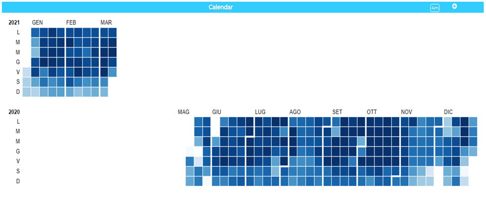
By placing the cursor over the cells, you can view associated details such as date and value.

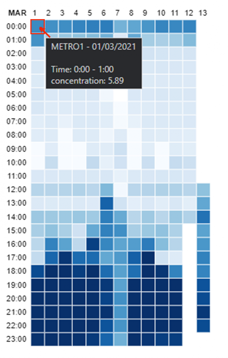
- monthly view - data is grouped by month and on the calendar you can see hourly variations over the days.
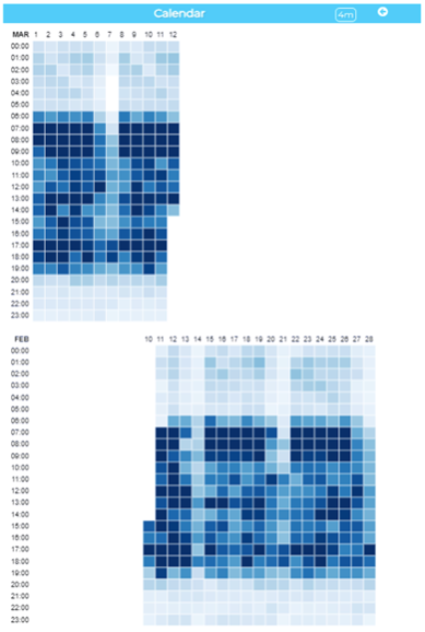
In the monthly view, for each cell, in the details there is an additional information: the reference time slot of the value. Like the annual view, to view the data you should simply place the cursor on the cell of interest.
2. How to add a Widget Calendar in a dashboard
To add the widget you can do that via:
- Wizard Tool
- IoTApp
2.1 Wizard Tool
Once your dashboard is created, by entering the edit view and by clicking on WIZARD the following window will appear:
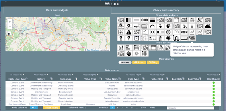
Select from the single data widgets the calendar icon one
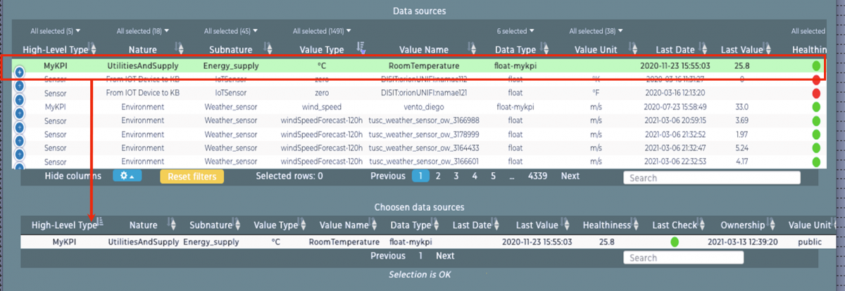
Afterwards select a data source of choice among those available and confirm the selection by confirming via the Next button
A window with a summary of the choices made will appear. If everything is correct, complete the operation by clicking on the instantiation button.
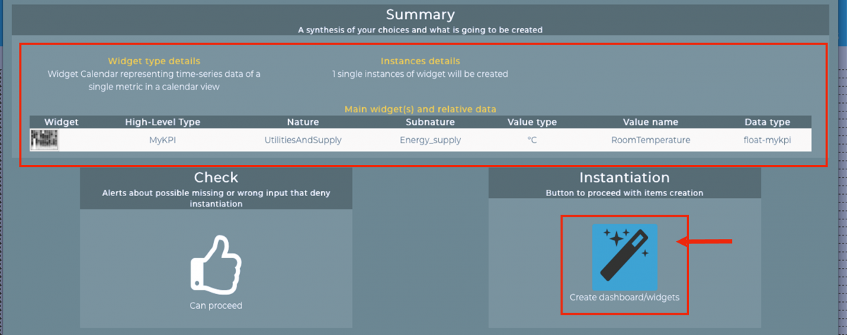
Now a new Widget Calendar will appear on your dashboard .
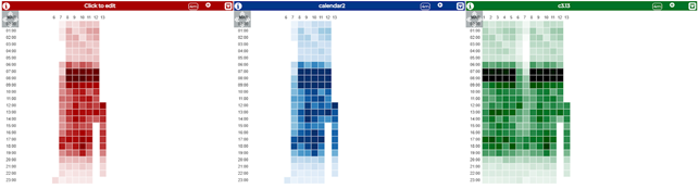
Examples:
2.2 IoTApp
On node-red, select the calendar node from the palette of snap4city nodes and link to that an input node inject.
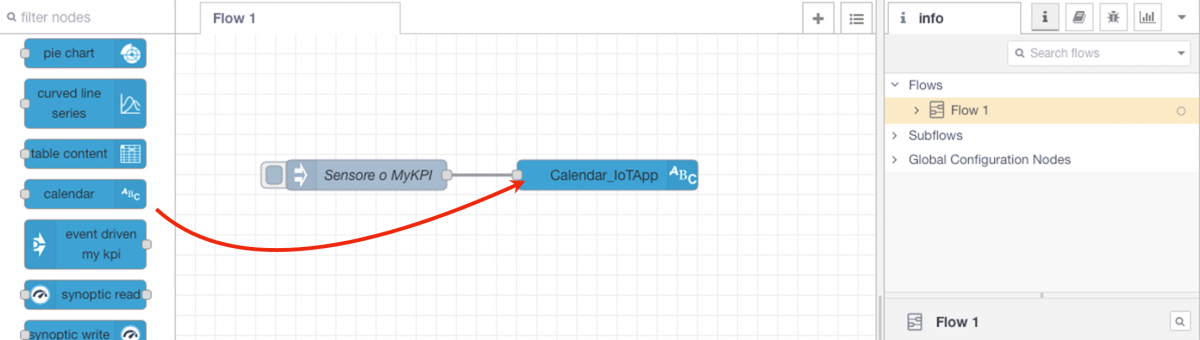 |
|
Enter the inject node settings by double clicking it, a window like the one in the image below will appear: Insert in the payload field the JSON of the sensor or of the MyKPI you want to use
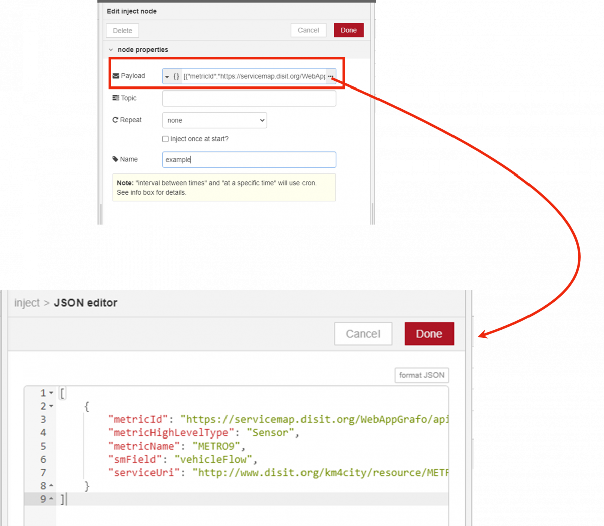
For example
[
{"metricId":"https://servicemap.disit.org/WebAppGrafo/api/v1/?serviceUri=http://www.disit.org/km4city/resource/IBIMET_SMART25&format=...",
"metricHighLevelType":"Sensor",
"metricName":"IBIMET_SMART25",
"smField":"airTemperature",
"serviceUri":"http://www.disit.org/km4city/resource/IBIMET_SMART25"
}
]
In the calendar node settings, select the dashboard where you want to put the widget and lastly click on the Deploy + Inject buttons to get the Widget Calendar on the dashboard selected.
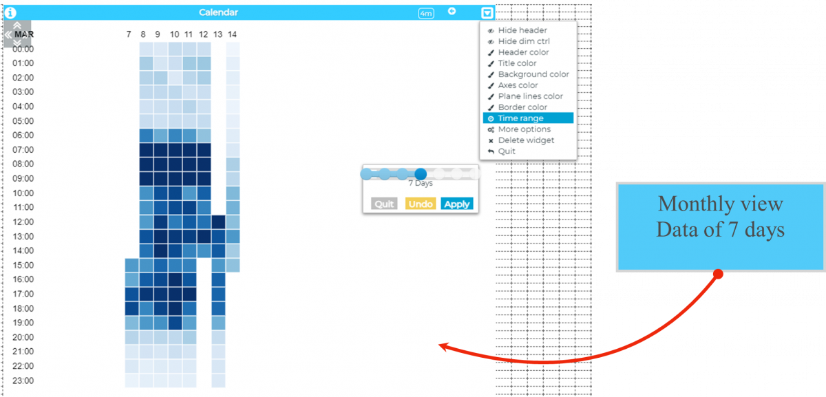
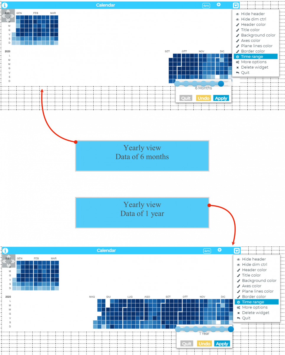
3. Time range
It is possible to set the quantity of data shown on the calendar chart.
In edit view you should just open the drop-down menu positioned on the top right of the widget and click on the Time range item to select the desired time interval.
The options available for both monthly/yearly view are :
- 1 Day
- 7 Days
- 6 Months
- 1 Year
Examples:
4. More options
The widget provides the possibility to modify, in addition to the generic and basic ones, the following options:
- data operation : sum/mean of the data for each cell
- calendar view: monthly/yearly
- color: to customize the color scale of the cells
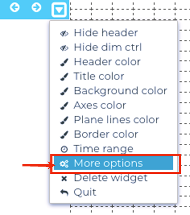
To do this, you need to access the edit view, open the drop-down menu at the top right of the widget and click on the More Options item.
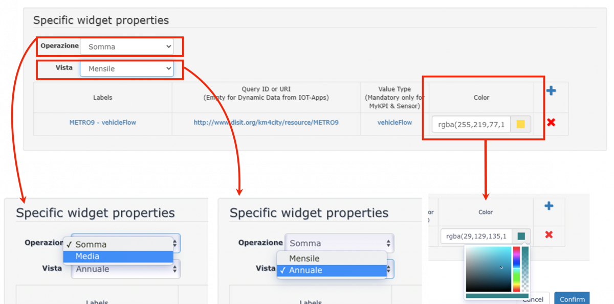
Once everything is set up, just click on the Confirm button to apply the changes made.