The DataCube widget is an implementation of the OLAP cube concept, a multi-dimensional array of data. Online analytical processing (OLAP) is a computer-based technique of analyzing data to look for insights. 'Cube' here refers to a multi-dimensional dataset, also known as hypercube when the number of dimensions is greater than 3.

The hypercube as well as the single cube can be sliced according to different directions.

The widget allows users to load different data sources and to compare them along various dimensions such as time, unit or metric. It also makes it possible to compare same metrics of different sensors. All of these possibilities are realized with a three-dimensional visualization, which makes it very easy for the user to compare and interact with the data source.

The Data Cube can be cut and sliced in many different ways. An object which has more than three dimensions can get projected in a lower dimensional space. The widget makes it possible for the user to perform a 'time slice' and a '2d projections' (Stream Graph).
Widget instantiation
In order to instantiate a DataCube widget, you can click on the Edit Dashboard Wizard. Here you can select the different metrics. You can also select the widget first, and then choose the compatible data sources.
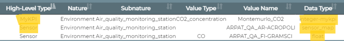
As shown in the picture, you can use:
- Sensor data sources (single metrics or the complete sensor map data);
- MyKPI data sources.
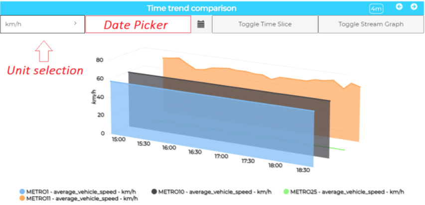
This is what you get when the widget is first loaded. A three-dimensional graph, showing one of the units through which sensor and metrics time series are compared. The unit can be selected with the menu in the top left corner. Right next to it, a Date Picker allows to choose the exact time at which the Time Slice is performed. Two buttons switch the graph view to Time Slice and Stream Graph. The legend is shown in the bottom of the widget. Hovering the mouse on a time series will show specific informations about the single points.
Widget configuration
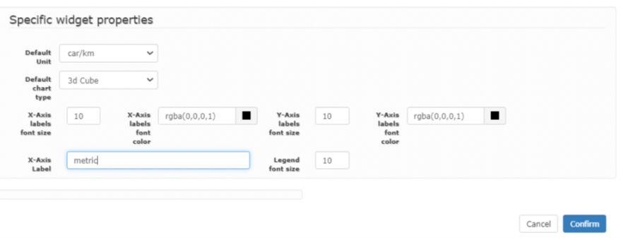
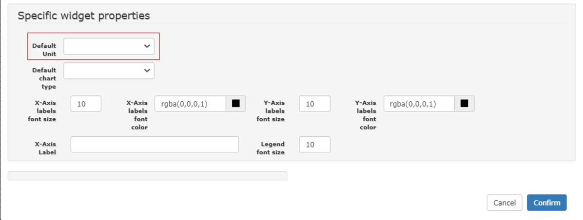
In the "More Options" menu, you can find the Specific Widget Properties, which allow for the selection of a Default Unit and a Default Chart Type, along with some more graphical options.
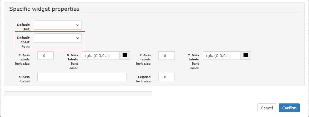
Selecting the Default Unit you can show the cube having the same value unit as y axis
Graph categories
Default Chart Type defines the type of graph that is first shown after the widget loading:
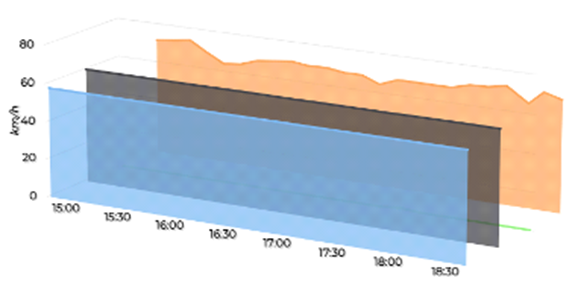
3D Cube
This type of visualization shows the time on x axis, the value unit on y axis and the sensors on z axis
Time slice

You can visualize the Time Sliced Data Cube in order to compare the exact moments in time.
This type of visualization shows a slice cut of the cube showed before at the selected time or current time if the data picker is left blank
Stream Graph

You can also use a Stream Graph to compare how the values add up in time. In this type of visualization we have a top view of the cube: the thicker is the line, the greater is the value